QuickFi: Rebuilding for Partners, Fixing What We'd Been Ignoring
Sole Product Designer, iOS and Android (design and Android implementation)
Timeline: Phase 1 redesign (navigation, notifications, document management, partner white-labeling)
Platforms: iOS, Android, Web
Users: Business owners financing equipment, both self-initiated and partner-referred
Here's what happened
15 min to 7 min
Task completion time cut in half
5 items to 4
Navigation simplified to real destinations
3 iterations
Before navigation actually worked
Zero
Billing and document support calls, post-launch
The Real Problem
QuickFi wanted manufacturer and dealership partners recommending the app directly to their customers, instead of waiting for business owners to discover QuickFi on their own. To get partners on board, we needed white-labeling, their branding, their colors, their identity, inside the app they'd be recommending.

That requirement meant rebuilding the parts of the app that were actually holding partners back, not just patching around them. It also meant I finally had the scope to fix problems I already knew were there.
The original app had real usability debt. Verification steps were unclear. Required document overlays vanished once dismissed, no way back in. Status information was buried. None of that was new, and none of it had been urgent enough to justify a rebuild on its own. Our earliest users were self-initiated business owners, comfortable enough with apps to route around bad design without complaining.
White-labeling gave me the mandate. The usability debt gave me the reason to use it well.
What I Was Actually Working With
The existing app was designed for one type of user. By the time we rebuilt it, the majority were the other.

The self-initiated flow was what the original app was built around. The partner-referred flow is what we were actually designing for.
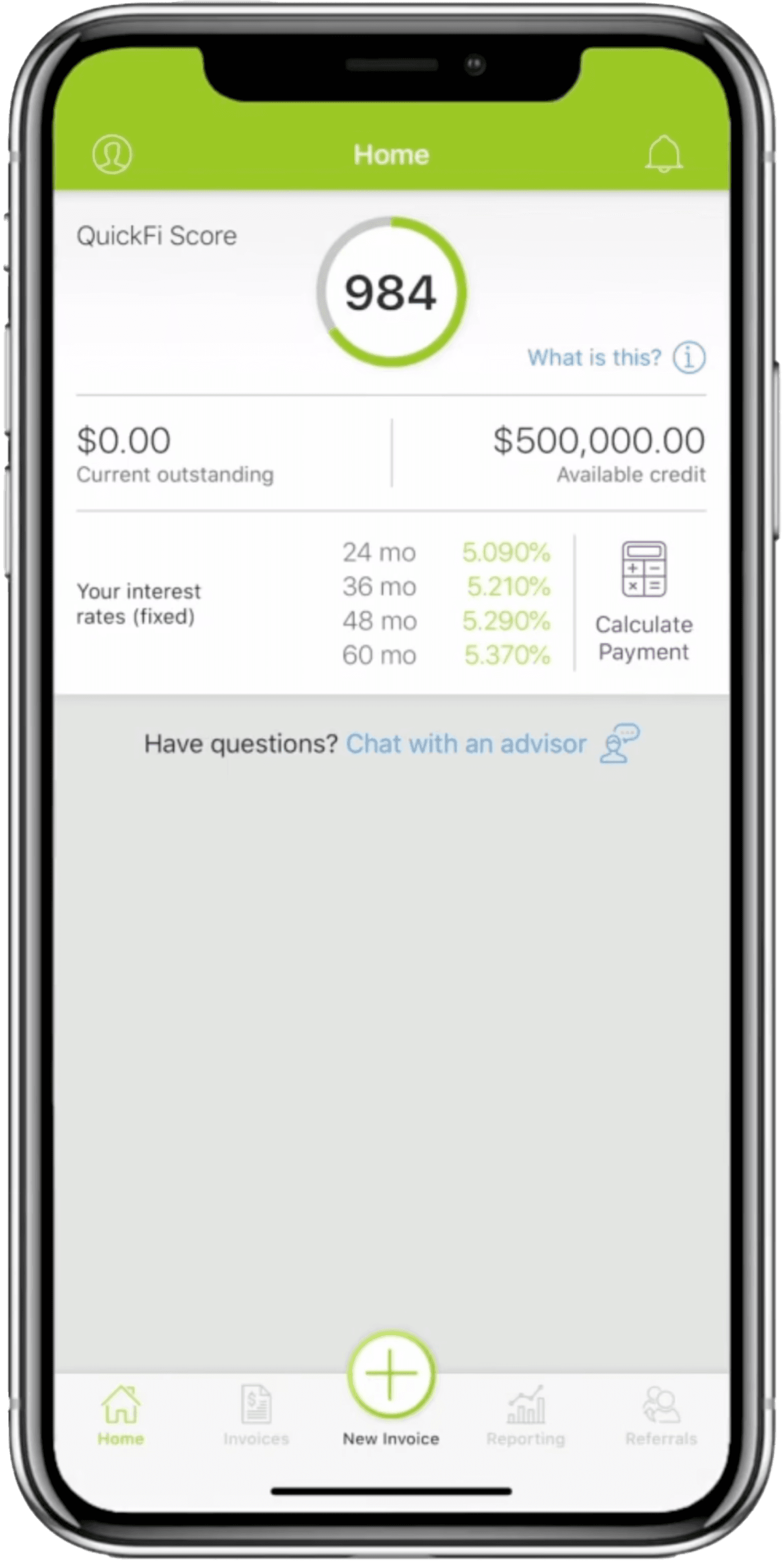
Five nav items: Home, Invoices, New Invoice, Reporting, Referrals. New Invoice sat elevated above the tab bar as a floating action button, the visual center of the app, built for a self-initiation flow that new users increasingly weren't using.
The home screen showed QuickFi Score, available credit, interest rates. Account information. No indication of what to do next. Someone arriving to complete a large equipment financing deal saw their score and an empty screen below it.
QuickFi Score wasn't on the same scale as a credit score, wasn't actionable, and wasn't meaningful to users. It wasn't particularly useful to the company either. It was just there.
Seven notification types fired as full-page overlays. Dismiss one, it disappeared until next login. Document upload only worked at initial login. Miss that window, you were calling support, which is exactly what the data showed happening.

Early sketch working out the information architecture for the redesigned home screen. The original showed QuickFi score and account data with no clear next action. This explored reorganizing around credit line details, rates, and available routes — moving toward a task-first structure before any pixels were placed in Figma
What the Calls Were Actually Telling Us
Support volume broke into three buckets. Pre-transaction: identity verification confusion, dismissed document overlays with no clear way back in, credit request status invisible. Post-transaction, less frequent: amortization schedule lookups, contract detail requests. Credit increase requests, rare.
Design blindness is real, and I had to account for it before trusting my own read. So I pulled demographic data collected during identity verification and cross-referenced it against call patterns. The result was clear. Users in manual trades, construction, landscaping, septic, generated a disproportionate share of the "where do I find this" and "what do I do here" calls. Not age alone. Occupation-linked comfort with software.
That was the real signal. Not which channel a transaction came through. Who was actually sitting on the other end of the screen.
Our support team was compensating for it directly, walking callers through the app step by step to find what they were looking for. They were absorbing the cost of the usability debt long before the redesign addressed it.
Matching Navigation to What Users Wanted
Navigation structure carried over from the existing app, and getting it right took three iterations.
Version 1 replaced Referrals with Billing, since repayment had no visible home in the original and that alone was generating calls. New Invoice stayed elevated. The underlying discoverability problem stayed untouched.


Version 2 moved New Invoice off the main nav into a FAB on the Invoices page. Correct call, it no longer needed top billing. But Required Documents was still an overlay you could dismiss into invisibility.


Version 3 folded Billing and Documents under "More." Clean on paper. Wrong in practice. Users calling in still couldn't find either. "More" is where things go to hide, not where people expect to look.
Each version narrowed the actual problem. Not navigation labels. Persistence. Information people needed had to survive being dismissed once.

What Actually Worked

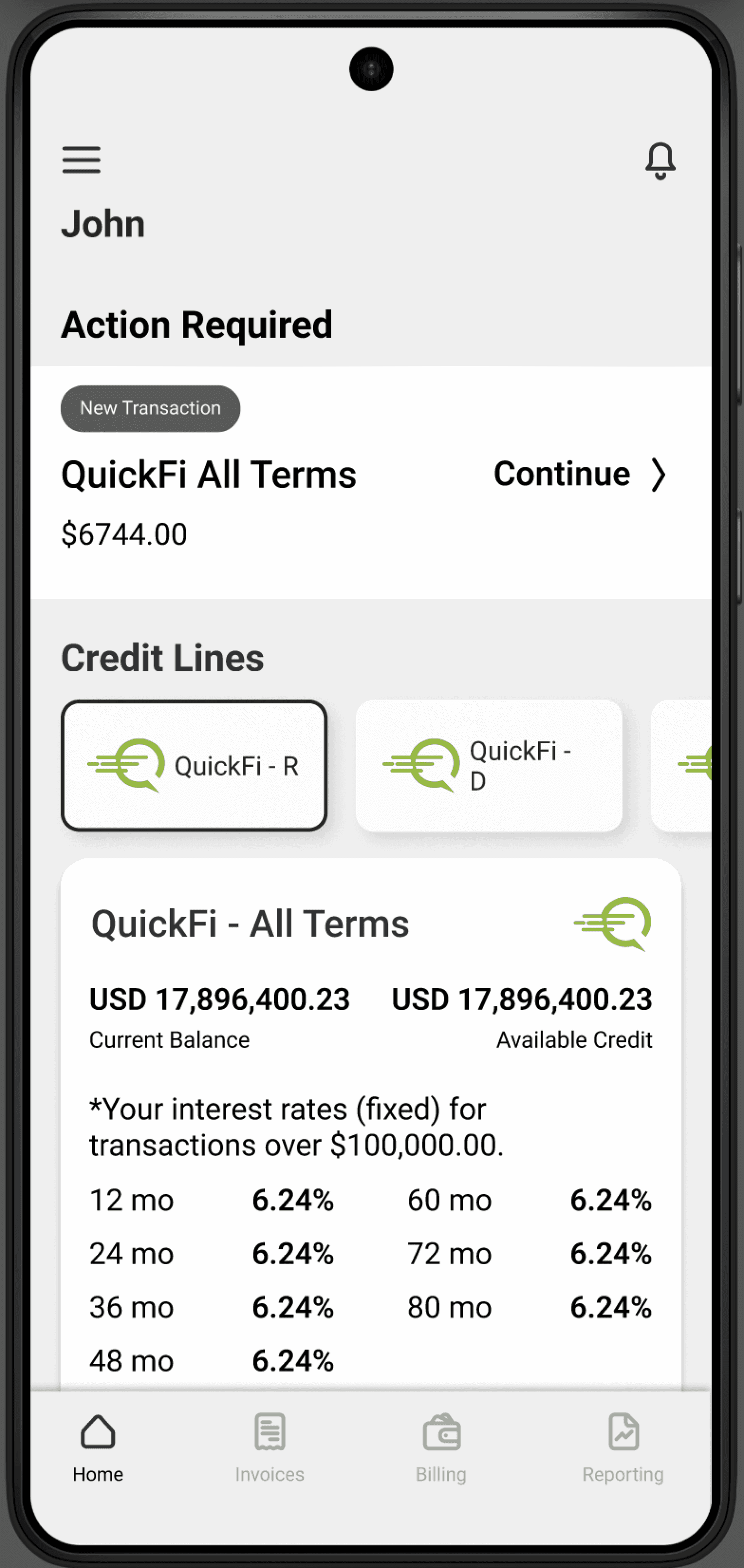
Final navigation: Home, Invoices, Billing, Reporting. Billing carries a permanent red badge for outstanding required documents, visible regardless of what's been dismissed. No more calls asking where to upload.

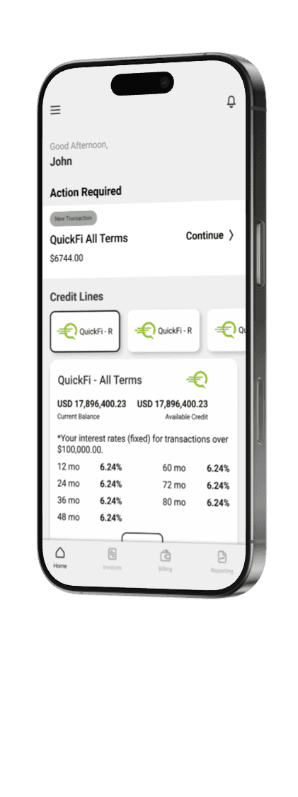
The home screen became task-first. "Action Required" at the top, with clear status labels: New Transaction, Amendment, Insurance, Ready to Sign, Equipment. Credit information moved below it. The screen now answers the question users actually opened the app with: what do I need to do right now.
White-labeling meant users could end up with more than one financing relationship live in the app at once, each with a different partner, different branding, different terms. I needed the home screen to make that distinguishable at a glance, not just navigable. I designed partner-specific credit line tabs, each carrying the partner's logo and brand color, so switching between an in-house QuickFi line and a partner-originated one was visually immediate, not something a user had to read to figure out. Balance, rate tables, and repayment options updated per tab, scoped to that specific relationship.
Partner colors created a second problem: they had to coexist with the app's own system colors, without clashing with error states, warnings, or notification badges. I retained only the partner's logo as an identity marker, and used neutral tones for highlights and borders instead of partner brand colors. QuickFi kept a visible identity throughout, and a partner's red or green never risked being read as a system error or success state.

I also designed the credit line and transaction display to scale to multiple simultaneous partner relationships per user, clearly separated by counterparty, even though no user had hit that case yet at the time. Partner volume was growing, and I didn't want clarity to become the next invisible debt once a user financed multiple items through two partners at once.
I restructured notifications by urgency instead of chronology. Critical items persisted as a home screen task list. Everything else stayed categorized without interrupting the primary flow.
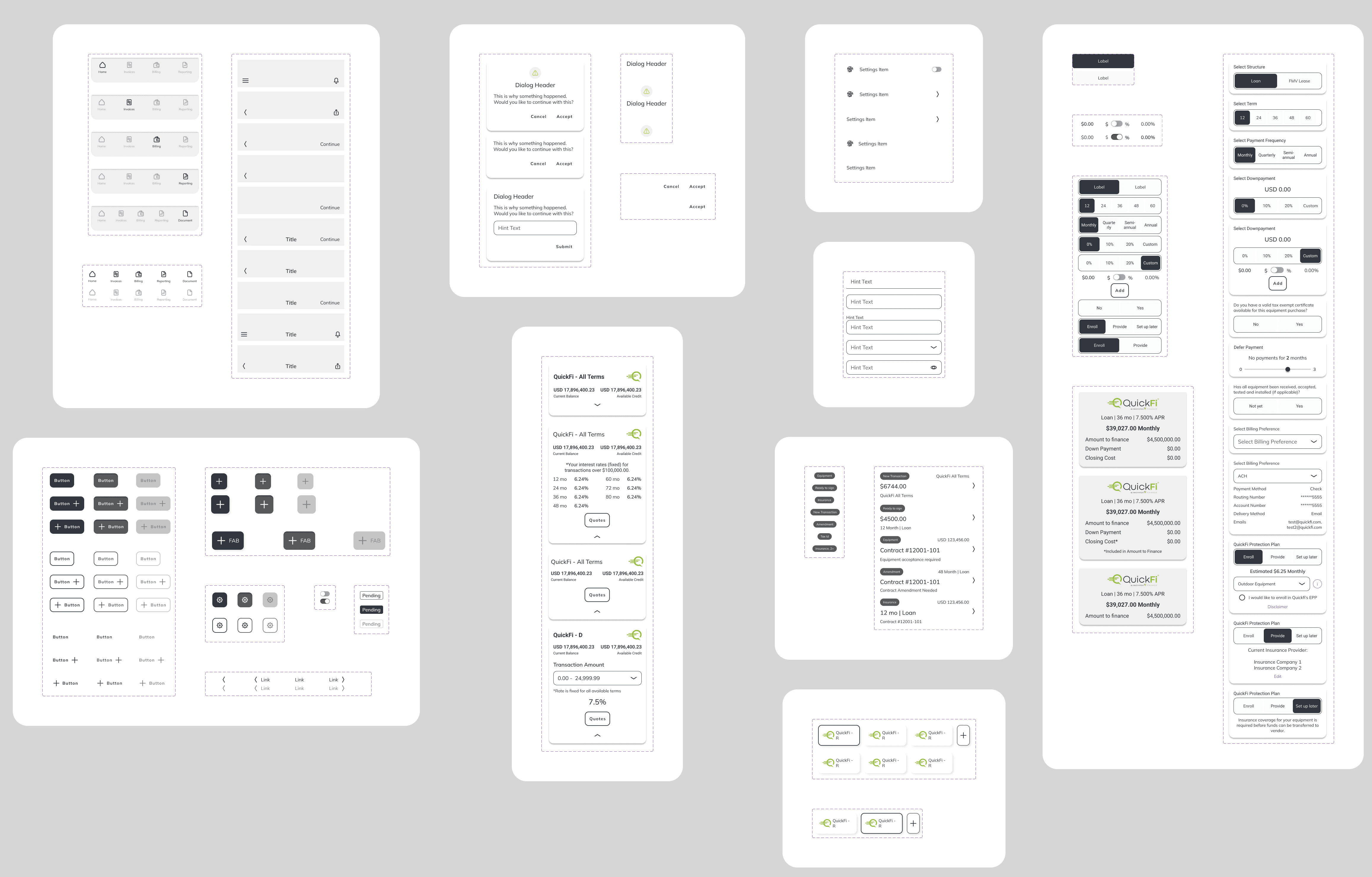
Reconciling design between iOS and Android used to eat sprint time every cycle, manual comparison, manual fixes. A token-based component library ended that. Both platforms started from the same spec instead of two people's interpretation of it.

The rebuild also shipped dark mode, a smaller effort riding on the same component overhaul, but a visible signal of how far the design system had come.
What Held Up
The design system started enforcing itself in code instead of being maintained by hand. Both platforms now build from the same token spec instead of two people's interpretation of it.
The icon set held up the same way. The existing icons were PNGs with no source files, predating the rounded corner language of the rebuilt app. Rather than patching an inconsistent set, I built 75 custom icons from scratch, consistent grid, stroke weight, and corner radius throughout, and brought them into the Figma component library as part of the same system.

What I'd Do Differently
I'd have run the occupational cross-reference against support calls on day one instead of after several rounds of chasing the wrong variable. Support had already been compensating for the gap for months, walking callers through the app manually. That was a diagnosis sitting in front of me before I went looking for one elsewhere.
The task-first principle from this redesign, surface what the user needs to do next, not just their account state, held up outside this project too. The same logic later shaped the deal details page on QuickFi for Partners.
Cross-platform work also taught a sharper lesson than "platforms are different." A button relying on hover doesn't translate to touch. On mobile web, a hover-dependent interaction can take two taps to register instead of one, the first simulates the hover, the second fires the click. What reads as a small affordance on desktop becomes friction on a phone, and I design around that now by default.
What's Next
Complete
Phase 1
Now
Phase 2
Sign Up flow redesign that led to Mobile-Originated credit application to go from 0% to 56%
Case study coming soon.
This is Phase 1. QuickFi is now in Phase 2: rebuilding the sign-up flow to remove the barriers that locked users out of the app during credit review. ID verification, insurance, and payment preference now happen inside the app while the credit application is still pending. That case study is coming.