
QuickFi Design System: One Source, Any Brand, No Rework
How do you let unlimited lending partners white-label a finance app, without a designer touching color for every one of them?
Role: Sole designer — token architecture, contrast auditing, component design, native Android implementation
Collaborators: iOS engineer, web engineer, marketing
Platforms: iOS, Android, Web
Status: Android SDK live. iOS and web distribution in progress.
How This Started
This didn’t begin as a design system project. It began as a component library: buttons, inputs, cards, built to stop rebuilding the same things across releases. Color, spacing, and typography had no formal rules. We just had components.
Then the company website was rebuilt using AI. The green that came out of it wasn’t QuickFi’s green. It was close, but different enough that nothing matched. I flagged it to management: which green are we actually using? That question didn’t have a clean answer, and that’s when it became clear that a component library wasn’t enough. We needed a system.
The white-labeling requirement had existed since Phase 1 of the app redesign. Partners needed their brand inside the app, not just a logo on a QuickFi shell. But the early approach was manual and limited: logos as the brand signal, no color. The design system gave me the architecture to solve that properly.
The Real Problem
QuickFi’s lending relationships are white-labeled. A financial institution or dealership runs its own credit line inside the same app. A borrower might hold multiple lines: one from an equipment manufacturer, one from a separate attachment vendor, each needing to feel like its own program.
That created a problem with no natural ceiling. Every partner that signs on needs the app to feel like theirs. But the partner list grows by business development, not by design decisions. A system requiring hand-designed color work per partner gets slower and riskier with every new signature, right when the business needs it to get faster.
And this is a finance app. Every screen carries real numbers: payment amounts, APRs, amortization tables, for users that include people with low vision. Accessibility was the primary design constraint, not an afterthought. A contrast failure on a payment figure isn’t a visual inconsistency. It’s a usability failure.
The brief I set for myself: build one coherent visual language that works natively across three platforms, and make it reconfigurable per partner without redoing the design work or the accessibility audit every time.
Four Ground Rules
A few decisions made early did more work than any individual token.
Native, not ported.
iOS gets Dynamic Type and TabView. Android gets Material 3 and NavigationBar. The system shares tokens, type roles, and information architecture, not pixel-for-pixel layouts. A translucent iOS tab bar on Android doesn’t read as brand consistency. It reads as an iOS app that was ported.
No raw values in components, ever.
Every color, size, and spacing value binds to a semantic token. This single rule is what makes adding a new partner possible without touching components. A component referencing a hex directly is a component that has to be found and fixed by hand for every future partner.
The elevation direction flips by mode, on purpose.
In light mode, each nested surface steps slightly darker. In dark mode, the same nesting steps lighter. That’s correct. It mirrors how iOS’s own system fill levels work. But it looks like a bug in a swatch grid, and I got it wrong once myself before I wrote the rule down. A fix that made both modes consistent would have quietly broken dark mode’s whole reason for being a mid-grey elevated scheme instead of near-black. So there’s an automated check for it now, not just a rule in a doc: any dark value sitting below container/background fails the build, because a token darker than the background reads as a hole punched in the screen, not a layer on top of it.
Every contrast pairing measured, not eyeballed.
51 foreground/background pairings, hand-catalogued, checked by script against WCAG thresholds on every change. Not because the eye can’t be trusted, but because a system that looks right and a system that’s proven right behave very differently six token changes later.
Architecture: What a Value Is vs. What It Means

The token source splits into two files with two different owners.
tokens/values.json is machine-written: color values per mode, type metrics per platform. The Figma plugin owns it.
tokens/source.js is hand-written: grouping, platform identifiers, and the documented reasoning behind every token. I own it.
Neither can silently overwrite the other’s job. A loader asserts the two agree before anything downstream reads them. Every output, including iOS Swift, Android Kotlin, CSS, the Figma plugin spec sheet, a plain-language design brief for AI workflows, and a browser-based Inspector, is generated from that single source in one command. CI fails if any of them drift.
This sounds like an engineering detail. It’s a design decision. It’s what lets one contrast choice land identically across three codebases instead of hoping three implementations stay in sync by discipline alone.
The Button Decision
The hardest design problem in this system wasn’t a color. It was a button.
The problem first surfaced during Phase 1 of the app redesign, when partner colors started appearing in the interface. Red partners looked like destructive actions. Green partners looked like success states. Blue partners blurred into informational UI. Using brand colors on buttons meant every partner needed their own accessibility audit, and even then the risk of misleading users remained.
The fix at the time was partial: logos as the brand signal, no color on buttons. But when the design system work restarted, I went back to the button question properly. By that point QuickFi’s own green was gone from the UI too. Getting any green button to pass contrast without looking like a success action is genuinely difficult. The problem wasn’t just partner colors. It was any brand color.
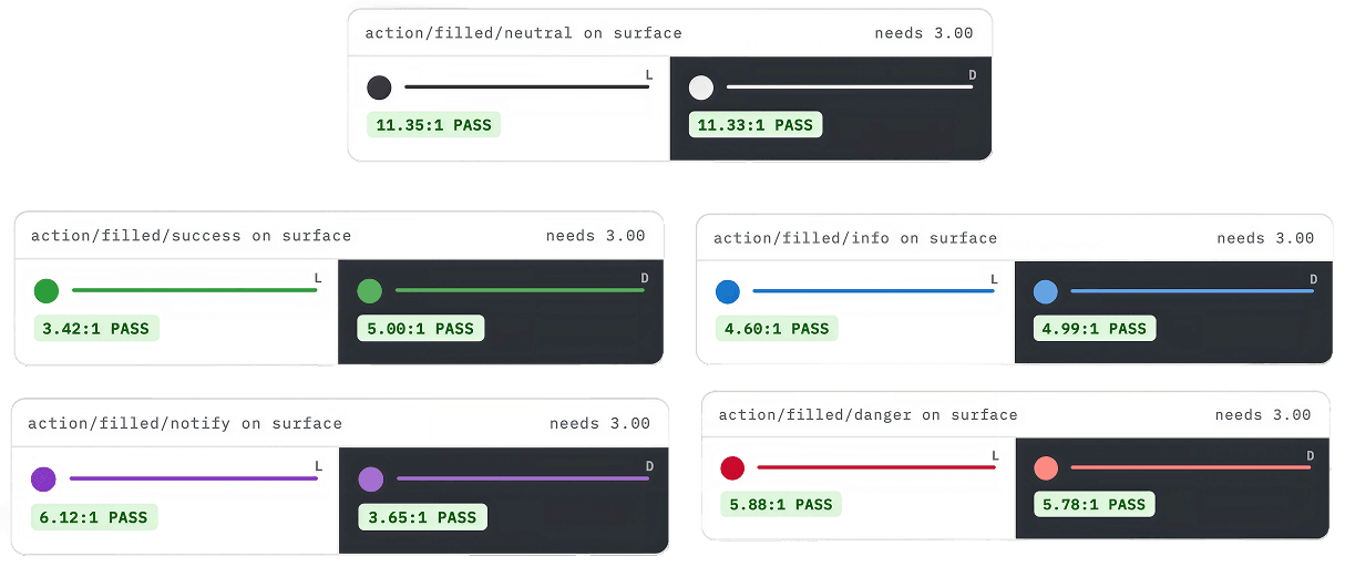
The decision: there is no brand button intent. Filled buttons come in five intents — neutral, notify, info, success, and danger. Neutral is charcoal, not tied to any status meaning at all, and it’s the default: the majority of actions in the product, Save, View, Manage, carry no status connotation and shouldn’t borrow one. The other four each map to a feedback semantic instead. Danger, for example, reuses the badge red rather than the error red, since a destructive action isn’t literally an error state. Every primary and secondary action binds to neutral, regardless of which partner is active. The partner’s color still appears constantly, but as an accent: a chip, an emphasized amount, a focus ring, a link. Never a button fill.
That one constraint turned “design a palette per partner” into “compute a small, fixed set of accent tokens per partner,” a problem small enough to solve algorithmically.
The Color Engine
Once buttons were off the table, what actually needed to vary per partner was small: a faint tint across the structural surfaces, a selection color, one accent color, one more saturated hero card surface, and the link and focus color. Fourteen tokens, derived from one seed hex, computed at runtime.
The approach is inspired by Material 3’s tonal surface system: a seed color in, a derived palette out. The algorithm preserves the seed’s actual hue, caps chroma hard (0.14 for the accent, 0.05 for the tonal card) so a saturated logo reads as a muted accent rather than a logo pasted into the UI, finds the least extreme lightness value that clears 4.5:1 against the surfaces it actually sits on, and derives hover and pressed states as a composited layer rather than three hand-picked tones.
But the algorithm isn’t the point. The point is that I stopped trusting it by eye and made the guarantee provable. The test suite runs against the four real partners registered today: a green that happens to risk collision with success states, a red that happens to risk collision with error states, and two blues sitting 6 degrees apart in hue that happen to be close enough to confuse. None of those four were picked to be hard cases. They’re just what the partners’ actual brand colors are, and the system has to hold up against them regardless. The real adversarial coverage comes separately, from a synthetic sweep of 216 seeds built from every 15 degrees of hue at three chroma levels and three lightness levels, covering colors nobody has picked yet. Zero contrast failures across all of them.
The accessibility guarantee for the next partner’s color was proven before that partner signed a contract.
What if two partners share the same color?
It’s a reasonable concern. Two registered partners have brand blues sitting about 6 degrees apart in hue. I considered nudging one seed to create more visual separation and decided against it.
The goal of the brand engine isn’t to make every partner visually distinct from every other partner inside the same app. It’s to make the app feel like it belongs to whichever partner the user is in. A borrower financing equipment through two different partners isn’t comparing the two interfaces side by side. They’re completing a task. The app carries the partner’s logo, their color, their program name. Even if two partners share a similar blue, each program still reads as its own.
A partner’s real published color outranks a synthetic disambiguation rule. And the in-app signals that actually differentiate programs — logos, program names, credit line labels — go further than color alone ever could.
Interactive component: Change the hex and watch it work.
Brand engine — live preview
Computed at runtime from one seed. 14 tokens derive in both modes.
Proven across 220+ seeds — including a 216-seed synthetic sweep.Open Inspector →
Iteration: The Bug the System Had Already Warned About
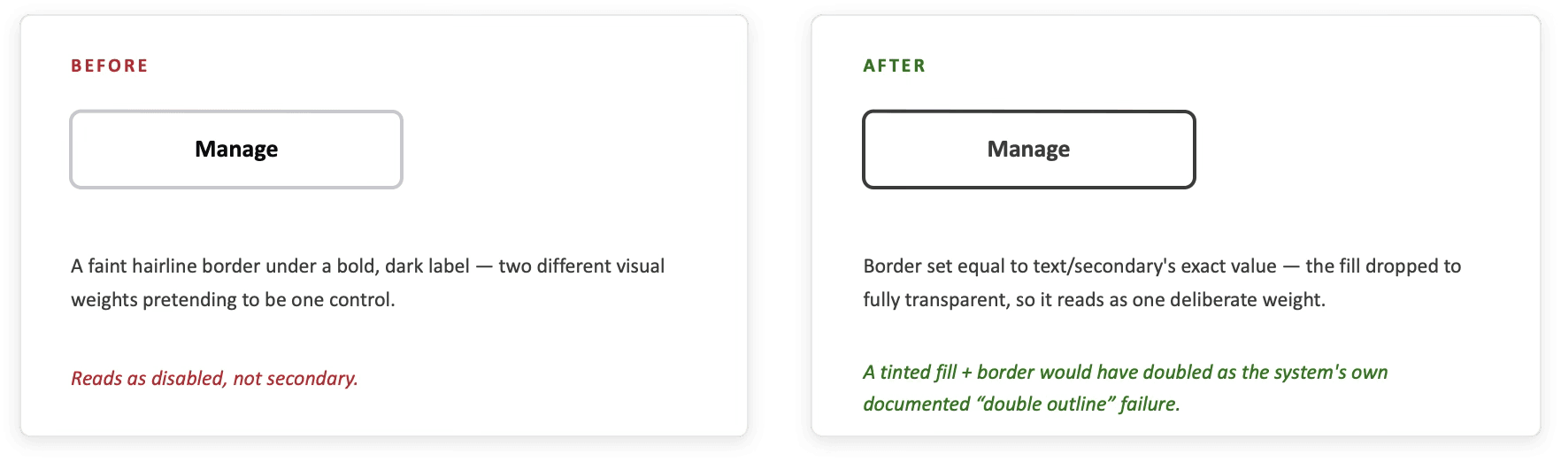
Partway through, a screenshot surfaced a real problem. An outline button whose border and label read at different visual weights: border nearly invisible, label bold and dark. The control looked disabled rather than secondary.
The root cause was a token mismatch. The border was bound to a value that had no relationship to any text token, so nothing enforced the two reading as one control. The fix wasn’t a new color. It was collapsing the gap on purpose. The border now matches text/secondary exactly. The fill dropped to fully transparent.
That second change mattered as much as the first. The system already had a documented failure mode: a bordered card on a tinted background reads as a double outline. The old button was quietly committing it. The fix resolved both problems at once, and the two token identities stay separate in the source because a border audits at 3:1 and a label at 4.5:1, the same color today, not necessarily forever.
The system had already named the failure. The bug was caught because the rules were written down.
Iteration: Cutting a Redundant Role

The mobile type scale carried two roles at the same size: display and numericLarge, both 28pt, serving different conceptual jobs at one identical measurement. And 28pt is small next to Apple’s Large Title at 34pt or Material 3’s Display roles. It wasn’t earning its place as a hero size on mobile.
Rather than pick a winner, I cut both from mobile entirely. Mobile’s real ceiling is title at 22pt plus a numeric amount. Both roles stayed on web, where a genuine hero size exists. In their place, numericSmall was added for the dense contexts, table cells and list row trailing amounts, where numericMedium was already being used but was too assertive.
The validator had to change too, not just the tokens. The old rule assumed all platforms declared identical role names. That assumption was itself blocking the right decision.
Eight roles on mobile instead of twelve. Four identical between iOS and Android, four differing by exactly one point: a real platform difference, not drift.
Iteration: The Selection Color No One Was Auditing

Selection was originally treated as a state, not a surface, so it stayed a fixed neutral value while the ambient container tint work went ahead around it. That reasoning held right up until the tint landed on every surface beneath it. A grey selection surrounded by hue-washed surfaces doesn’t read as neutral. It reads as an absence of color, the same visual signal as disabled.
The audit script never caught it, because a selected row and a disabled control are never rendered on top of each other. They’re only ever confused with each other side by side, and a contrast table checks pairings, not resemblance. In dark mode the two measured 1.005:1: functionally the same color under two different names.
The fix made selection brand-derived too, at the same chroma cap as the hero card tier, a step past the ambient wash so a selection reads as chosen rather than as more surface. A check now measures the derived value against the disabled fill directly, not just against the text sitting on it, because that’s the comparison a person actually makes.
Same pattern as the outline button. The bug wasn’t found by staring harder at a swatch. It was found because the system had a place to write the comparison down, and once it was written down, it could be checked on every change instead of once.
Distribution: From Files to a Dependency
A design system is only as real as its least-implemented platform. For a while, the Android implementation was consumed the only way that existed: copy the generated Kotlin files into the app by hand.
That’s a bad seam for a system this design-driven. A fix on my side didn’t reach the app until someone remembered to re-copy four files. An integration review caught the failure mode directly: a file marked “generated, do not hand-edit” had been edited after copying in. The design system had no way to tell a synced file from one that had quietly diverged.
The fix was structural. The Android implementation now ships as a versioned library that the app takes a normal dependency on, not files someone re-pastes. It still compiles from the exact same source the token pipeline generates and audits, so there’s one copy of the logic, not a second one drifting in the app’s repo. A design system update is now a version bump the engineering team reviews like any other library upgrade.
Small piece of infrastructure. But it’s the gap between “the design system is correct” and “the design system is correct in whichever copy someone pasted in six weeks ago.”
The module is verified now, not just architected. A real build against JDK 18, AGP 9.2.0, and Kotlin 2.4.0 caught two problems this environment couldn’t: a hardcoded import pointing at the consuming app’s own resource class, a leftover from the copy-paste model, and font files that had never actually shipped inside the library. Both were fixed before the first tag went out. Six unit tests pass, including a byte-for-byte comparison between the Kotlin brand engine and its Node source, so the two stay proven identical rather than just written to match.
iOS distribution via Swift Package Manager and web distribution via a CSS file are the natural next extensions of the same model.

30 text pairings. Every ratio measured. Every one passes.
Tooling: Making the Audit Legible, Not Just Correct
None of the rigor above is useful if it only lives in a script’s exit code. Alongside the token pipeline, I built an Inspector: a single self-contained page, no build step, that renders every color pairing against the system’s own token surfaces, so designers and non-designers can test color, typography, and spacing changes before exporting a PDF to share with stakeholders. Real foreground on real background, light and dark side by side, each with its own live-measured ratio and pass/fail verdict.
The Inspector also has a live brand-seed picker that recomputes all 14 runtime tokens and re-renders mobile and web previews in real time, exports a print-ready spec document, and generates a working Figma plugin data file, all from the same source of truth everything else reads from.
The goal: a stakeholder or a future me could see why a pairing was allowed or disallowed, not just take a script’s word for it.
By the Numbers
64
Color Tokens
light + dark values, independently audited
116
Contrast Pairings
automatically on every push — 552 individual assertions across text, graphic, and surface-separation thresholds
14
tokens computed at runtime per partner, from one seed color, proven safe across 220+ seeds
26
Type Styles
8 shared mobile roles, 2 web-only, generated from one source
3
Native Platforms
iOS, Android, web - one token source
1 line
added to a seed registry per new partner — no design work required


What I’d Do Differently
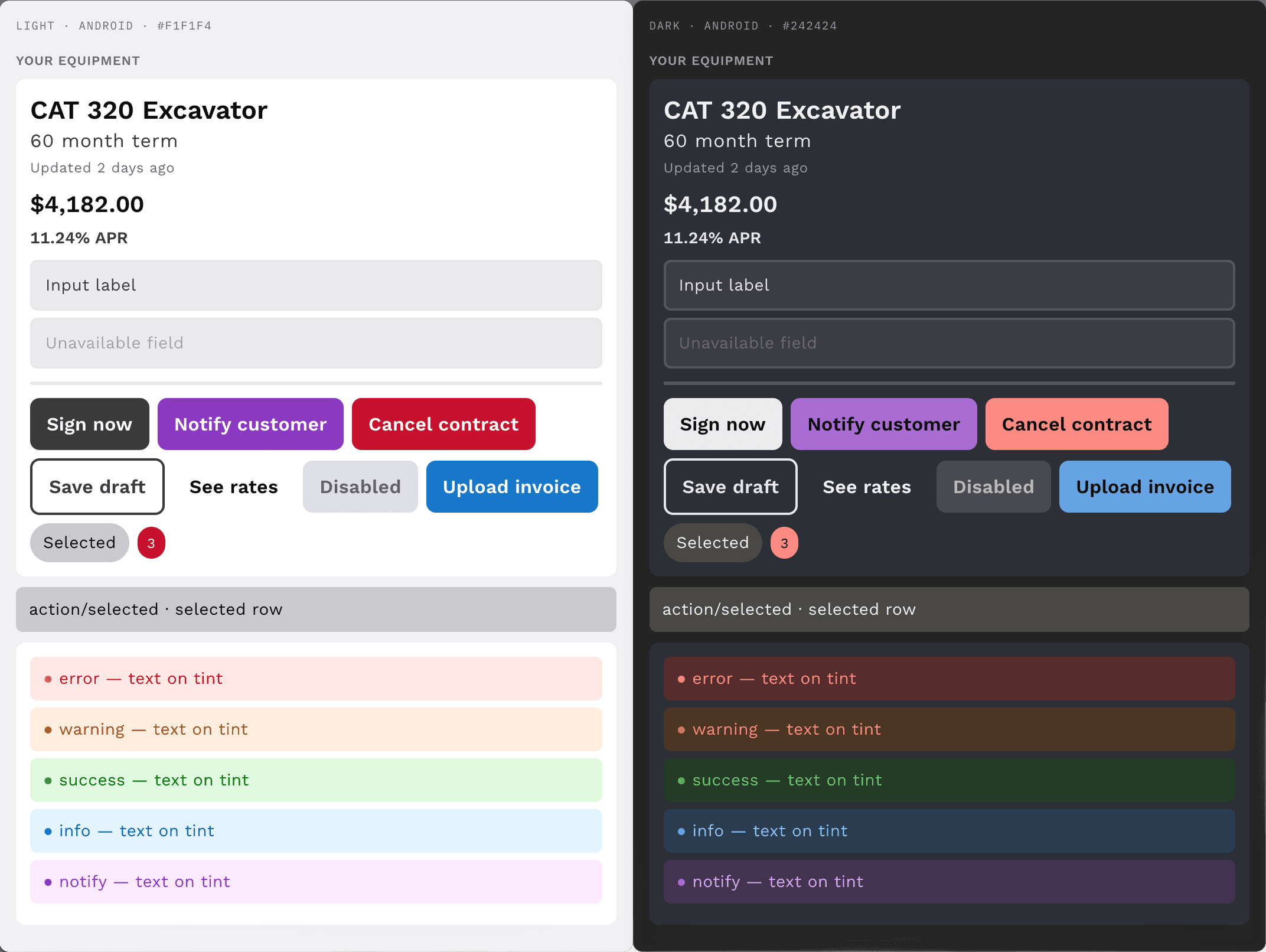
Android is ahead of iOS and web in implementation today. That’s what happens when you verify one platform properly before moving to the next. I’d rather ship one platform proven than three platforms assumed. iOS and web have the system. Native implementation is catching up.
Distribution has the same asymmetry. Android ships as a real dependency. iOS and web still rely on someone copying files in. That’s the next gap to close, not a new one.
The color layer has 552 automated assertions. Typography and spacing don’t have the same rigor yet. That’s not an oversight. Platform-specific sizing requirements make a cross-platform typography validator genuinely harder to write than the color checker was. It’s the next thing, and the approach is already written down.
The gap I can’t close alone: this system was designed by one designer, in collaboration with an iOS engineer, web engineering team, and marketing, but without peer review from a senior design systems practitioner. I’ve studied how mature systems handle the problems I was solving. Studying isn’t the same as having someone who’s built at that scale tell you where your thinking is wrong. That review is the next step that matters most.